
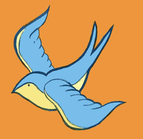


Here are a few quick color studies I've done for a couple of tattoos. My whole color scheme is mostly orange and blue with yellows, pinks, and reds. I want them to be bright but not overbearing, and I feel like a couple of these seem too solid rather than flat and tattoo-like. I guess the best thing to do is create separate textures for each and use those to create the color schemes, so that will be the next step in the process. So far, my favorite is the gun, but again it is too overwhelming and hard for the eye to handle due to the vibration between the orange and blue. I'll have to tone it down. More to come soon!
Also, I've been playing around with Flickr and uploading images in one big file instead of blogging all of them and then editing them into one post. I don't want to hog up room on follower's reading lists. I'll get the hang of it!

No comments:
Post a Comment